Friday 25 February 2011

This month in... 1991


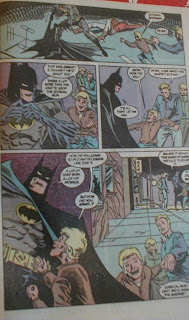
Alan Grant was a way into his run on the title and it really shows here - Batman is pretty much a bystander, taking a back seat to Jim and Sarah's trip to the cinema.
Its a nice tale, if a bit naff with Bats telling the brat of a boy that he owes much to Mark Of Zorro, and it has an excellent, dramatic ending with Gordon having a heart attack.
But, the art.
Nothing wrong with Norm's pencilwork, the colouring is a complete mess. Muddy, incomprehensible, with jarring out of the place tones - light blue for the night sky??????
It ruins a nice tale and relegates it to:
Bat-mark - 5/10

Tuesday 22 February 2011

The Joker - face nearly done.


Just got to tidy up the lip line then the best bits over. With paint on him now, its even more evident just who's version he's based on, yes?

Saturday 19 February 2011

What colour a Joker?


So here he is all assembled. Minds turned to what colour his clobber'll be. Its got to be purple of course for the suit, but i'm thinking of a real dark shade to really contrast with the whiteness of the face.
The trousers have a pinstripe cut in but there's no way i'm going with the palaver of picking them out.
Most build-ups i've seen have him with white gloves, but i'm going with purple.
And have decided to follow this example for colours of the shirt and waiscoat.

Wednesday 16 February 2011

The Joker


Been building model kits from, i guess about 1970, and film and Tv one's from about the late 80's.
Oddly though, the Joker is a character i've never attempted in the past.
For me, if i'm choosing a kit of the fella, top of the list is this stunna produced by Horizon waaaay back.
Its clearly based on Brian Bolland's "Killing Joke" incarnation, which for me is about definitive.
So real chuffed to get one - but am even more chuffed to see in the raw vinyl what a stunning likeness there is on the face. You'll have to trust me on this for now as the whiteness of the material will make any close up a complete waste of time.
Here you can see the component parts. I'm going to do away with the rather clumsy flower, electing instead to pay the craft shop a visit for a substitute. First buy though is some Plaster Of Paris to fill those hollow legs.

Tuesday 15 February 2011

The Batcave 1968


How i loved this image back when i were a nipper, pouring over the details endlessly. Highlights were/are the Batmobile so reminiscent of the TV shows one, the ramp up and out of the place and the curious cloudmaking machine to disguise the launch of the Batcopter/plane.
Brilliant stuff.

Lovely images - Neal Adams does a Bob Kane


Was having a browse today through the oddity that is "The Batman Gallery", a comic size collection of covers from 1992.
By far the best thing in it is this iconic image from Bob Kane of Detective 31 from 1939. Second best is Neal Adams' stunning recreation from Batman 227, 1970.

Thursday 10 February 2011

The history of the Batmobile


This stunning piece of work is doing the rounds on the Net, so thought i'd put it here.
Trouble is, its SO big an image it won't fit. So here's a taster and the rest can be found at:

http://m.jalopnik.com/5726457/this-is-every-batmobile-ever

Its a lovely idea handled brilliantly. What's a surprise is just how many versions there's been - some excellent, some duff.
Think i'll have a good look and try and come up with my favourite. And least.

Tuesday 8 February 2011

Just bought: Brave and the Bold 86


Was in my local comic shop today, nothing was in my box, no GN's took my fancy, so thought i'd get a back issue.
Chose this one as (1) Its got THAT Bat-logo, (2) Its a Neal Adams cover (didn't mean he'd be on the inside, but i was willing to chance it), (3) Its from October 1969, a time i never read the title - don't think my local shop stocked it and didn't start reading it until the late 70's when i started going to London for my comics.
Anyway, get home, open it up and - hurrah! - Neal is on the inside too.
And its some real nice work although, as seen from the very first page, it suffers from some shockingly bad colouring. Okay, this page is meant to be at night, but the light blue, mid blue, pink is just a mess.
Doesn't get much better later on when we have the likes of this double spread going the other way, showing very well that we're at the end of rainbow era of the late 60's and just about to go into the Glam of the 70's.
Its a shame as, if you see beyond the colouring, there's some excellent work by Mr Adams.
The story doesn't help matters (dunno who the culprit is as there's no credits for anyone. At all.) having Batman attacked by Robin, who's nicked the bad guys pistol. Bats stops him by a quick "Wap" across the face and Robin comes to, with no recollection. Gordon arrives and does the same thing. Brainbox Batman makes the huge mental leap of these two events that "There's only one answer... But its too incredible to believe.. But it MUST be! My old friend... Deadman is trying to kill me!"
And from there we go waaaay down hill as we find Boston Brand is being compelled to kill Btaman, can't do it, takes over his brothers body (who just happens to be in a Deadman outfit), they fly off to the Himalaya's, have a show down with the bad guys and Boston becomes solid agian, even though he's dead. But reckons he'll become a ghost again if he leaves.
Is a real confusing, muddled mess with muddled art.
Other than the cover, the only other thing that's memorable is the two page ad for American telly. How i used to study and drool over these shows that i could only yearn to see.

Saturday 5 February 2011

Off The Shelf - Poisen Ivy


This is the Horizon kit, built when it first came out. Real nice sculpt, what with it being 1/8th, and great fun to paint.
But the plant was a right boring chore to do, not helped by the fact its the main part of the kit.

Friday 4 February 2011

Favourite Bat-Films - #7 - Batman and Robin


Had to be here at the bottom didn't it? In fact, bottom's not low enough for this dirge. Really, really can't summon the energy to list what's wrong with this abomination - just watch the trailer and i'm sure it'll all come flooding hideously back.
ONLY good things i can say about it are:
George Clooney had the chin for the suit. If only it had been black and dark grey instead of the naff metallic mid grey. And if they'd lost the Bat-Nipples.
He also made a good Bruce Wayne visually. Would've been better if he didn't have the crewcut. And his gentle relationship with Alfred was the only good part to the whole film. Truely a diamond in a dog turd moment.

Tuesday 1 February 2011

First tale of the ... Joker


I thought it might be an idea to go back to the very first apperance of the Clown Prince Of Crime (God, what a crappy title) to see what was there from the off and how different he was to his modern incarnation.
So, Batman number 1 it is, dated Spring 1940.

He's not on the cover but there he is on the splash page of his tale, straight away showing the influence of Conrad Veidt in "The Man Who Laughs". And he's clearly in purple and gloves. Alex Ross in his excellent Mythlology book claims at the start he was clad in black with the purple only a highlighting device. Hmmmm... looks solid purple to me Alex. He's called The Grim Jester here but there's not that much in the way of comedy about him in the tale that unfolds.

On the second page we learn that the Joker is already known to the police and his trademark deaths grin for his victims is already established. Page 3 has the big introduction to the fella, sitting in some sort of trophy room "...with a changeless, mask-like face - but for the eyes.. burning, hate filled eyes!" Okay, another reference to "The Man Who Laughs" - the character in it has his mouth cut into a permanent smile by gypsies, so that no matter what he's feeling he smiles all the time. Next panels a close-up though and - he ain't smiling. That and the next panel he appears more Sherlock Holmes than Veidt. Also on this page we learn that Batman has known about the Joker for some time but "the time isn't ripe". He says that after the Joker has already bragged over the radio that he'll kill a gem owner and does, then announces a second. So, he knows the Joker will strike that first time and did nothing. He allows the second to happen. And only steps in at the third attack. Er... What?

Anyway, step in he does and, for the decades of clashes between the two that will follow, their first ain't 'arf a damp sqib - Bats holds on to the Jokers bright red getaway car while the Joker whips his gun out. The car crashes, the Joker hits Batman once, kicks him once and he falls in the river. That's it.

Batman seems quite pleased though, climbing out the river believing he has "at last met a foe that can give me a good fight!". Puta a damper on all the crooks, the vampire, hunchback and giant gorilla he'd already faced by then, yes?

Final shot of the Joker in this tale is classic Veidt, leering out of the regular State Prison, bragging that he'd be out soon.

So, the very first Joker tale presents him pretty much fully formed. Design-wise, he's not going to change really for 50 years or so - and why should he when its such a classic? The character's already there and won't change either. All that's missing are the outlandish props and plots of later years.
But you could say that of The Batman too.