Wednesday, 29 February 2012

Favourite Bat-Films - #4 - Batman


Its hard to be subjective about this one, what with not being to watch it without recalling the huge media frenzy that surrounded its making and release.
And, with Tim Burtons gothic take on things being suppressed quite a bit, the dire eighties trappings leap right out - bad hair, bad shoulder pads, bad music, bad acting, ruining the timeless setting they were going for.
Looking at it now on Blu Ray:
Micheal Keaton is still terrific,
as is Micheal Gough as Alfred,
that's a nice, basic looking Batcave,
Elfman's score is ace,
and the car's great.
But:
As good as he is, Nicholsen is just too darn podgy and too old for the Joker,
Kimmie can't act. At all,
that Knox guy is so smug and so unfunny, i want to do him harm,
but, most surprisingly of all, the Batsuit looks SO darn crude. It really does look like its carved from a bunch of old tyres.
But its still very enjoyable.
Just wished they got someone thinner and more Keatons age for the Joker - my top choice would've been Crispin Glover, failing that, Matthew Modine.

Tuesday, 28 February 2012

Huntress as Robin


From the upcoming Earth 2 series, that's a real nice riff on the design.
Hope the script matches it.

Saturday, 18 February 2012

Batman: Death By Design - done!


VERY happy to see that Dave Taylor has posted over on his Blog:

http://d-taylor-comics-music-ford-mustangs.blogspot.com/

that his much-anticpated Bat-tale is now done.
Been quite a wait, but know it'll be worth it.

Thursday, 9 February 2012

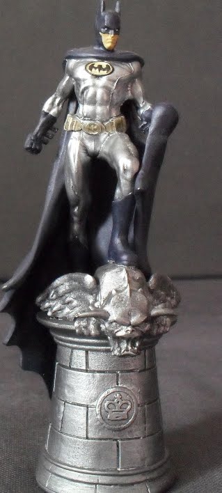
Batman Chess Set - Batman


Bit surprised to wander into a newsagents yesterday to find that Eaglemoss have started up a Batman Universe chess set.
I know Eaglemoss of old, having pretty much all of their Marvel Figurine run.
I never got their DC line though as its started when the Marvel one was still ongoing and i just couldn't afford it.
And i've always kinda regretted it.
But here we have a line of characters from my favourite DC series, combined with large chess pieces, which i've always liked the idea of.
So i've decided to collect the set.
Just like the Marvel line, the sculpts are excellent and, just like the Marvel line, fall down in some of the paintjobs.
I know it really can't be helped, and i feel for the poor sods on the production line painting them, but the lovely shots in all the ads are pretty much misleading - guessing they're especially painted for the ads.
So, i get Bats, get him out of his packaging and here's what you get:

Its a nice sculpt but the colour choices are odd. When does he have a silver suit and blue combos?
So, just like the Marvel one's i did, i'm not going back to the primer, rather i'll repaint certain areas.
With Bruce its:
Give the face a wash of a darker brown.
Have the Utility Belt yellow. In my mind, its always yellow - NEVER gold. Yellow is notorious for being far too thin and translucent, but here it worked to my advantage, keeping the really bright new yellow muted.
And the suit gets colours more suiting to Jim Lee era Bats, making sure i keep away from the white eyes as they're just about perfect and better than i could do.
I've left the emblem in gold and black just to make it stand out a bit more:

Still to do here is highlight the belt a bit, mark the edges between different bits - and remove that blummin' seam line.
While painting, i thought it was part of a high-tech Batsuit but, looking at these pics, its a seamline isn't it?
*Fume*
Anyway, its been a nice coupla hours and i'm looking forward to the next one, who's the Joker - with what looks like the same silver for his face that Bats has for his suit...

Wednesday, 8 February 2012

This month in... 1988


Its 1988, and Jason Todd has just taken on the mantle of Robin.
The covers a bit misleading in that there's not much action in it at all, consisting of mainly bickering between Batman and Nightwing.
Which is nice - character development and all that.
It, and the bust on a cocaine plant, are underscored though by Nightwings hideous outfit - its hard to be serious and gritty when one of the main characters as an appalling light blue glam-rock collar.
Still, the art by Jim Aparo is nice, with some neat panel repeating.
Bat-Rating: 4/10


Monday, 30 January 2012

Batman The Dark Knight #5


Was in my local shop the other day picking up my comics and i thought i'd dip me toe into another Bat-title, just to see what it was like.
I've read conflicting views on this one, but thought i'd give it a go as the art looks nice and i've always liked the Scarecrow.
So i read it and its a pretty humdrum, seen it tons of times before tale of Bats suffering the Scarecrow's fear gas while the baddie gloats over him.
With an appearance of Superman near the end that Batman almost beats in a fight - though i'm unsure whether it really happened quite that way or is another halluncination of the Scarecrow's.
So, humdrum its is, saved massively though by the execllent art by David Finch.
His Rogue's Gallery is excellent (though Catwoman seems to be about 12 here):

And his Scarecrow is even better, whether the trippy version or the real world:

So, didn't mind buying it, and will sure get the next one.
BAT-RATING: 5/10.

Thursday, 12 January 2012

Batman 197


Just bought this quite cheaply, which was a real surprise considering its hailed as the first appearance of the modern-age Catwoman.
That's a classic 60's cover right there and, of course, has the best ever Bat-header, this time done in a fetching purple. As i've said before, that logo is incredibly evocative to me, but something also here almost has the same impact - the one shilling stamp.
So, great cover - but shame about the inside...
We're well and truly in the midst of the TV show at this point and the tale could almost be an episode, being the story of Catwoman going straight to ursurp Batgirl in Batman's feelings, with wedded bliss being the ultimate aim.
Its by-the-book, going the TV show route of following cat related clues to their conclusion, with story and art veering around all over the place.
Like i say, a classic cover, but what immediately follows couldn't be described like-wise - a shot of Batman with that odd head to big for the body and Bat logo that looks superimposed over his chest that even the 5-year-old me found odd, coupled with possibly the longest monologue from Catwoman setting the tale up. I'd retype it for you, but i want this post to all be on the same page:

Other things of note art-wise is this really strange depiction of Bruce unmasking:

Did folk think the cowl actually worked like that?
We find out later why he was taking it off - he's painted his face black to keep his identity secret just in case Catwoman knocks him out and tries to take a peek.
Which she does.
She never removes the paint though as she's sure "some special chemical must be needed to remove it".
But never tries.
Hmmmm...

Nowhere near the best from this time period and not the best example of the the explosion of the TV show silliness, just ok.
BAT-RATING: 3 out of 10
Highlight for me is this ad for Major Matt Mason. I had the dorky looking exo suit and can still feel the longing for that walking thing.